
Collaborative Visualization is the convergence of user experience design and data visualization. This is the age of easy connection and collaboration! The continuously changing technology atmosphere consists of networked computers and mobile devices using shared displays such as interactive walls and tabletop surfaces.
Digital information is now accessible by multiple people to share and display information and data. It facilitates data analysis and making data-driven decisions. Visualization effectively deals with large amounts of information, while interactive visualizations allow users to explore the underlying data.
The interactive designs are engaging with delightful data visualization. It helps in improving user retention with better experience delivery.
Compelling visualization dashboards facilitate users’ interpretation of data, enabling them to make informed decisions. These visualizations simplify the data and maximize the human visual system.
Humans understand a graph through subconscious processing rather than conscious thought.
Let us share the example of one of our projects where we leveraged user experience best practices for data visualization. We developed a Farmers’ Hotline, or the Kisan Call Centre Scheme, launched by the Indian Ministry of Agriculture and Farmers Welfare. The call centers are functional in 21 locations in India.
The underlying idea was to support the farmers in the language they understand. 47Billion developed visualization dashboard using Tableau that majorly includes –
- Analytics on structured data
- Hidden insights into natural language
- Reports on deduced words diseases, sowing patterns, government schemes
- Targeted marketing for the district, state, and country
- Advertising campaigns, supply chain alignment pesticides/fertilizers based on location, commodity futures, govt. Scheme knowledge, services
The primary data source here was Kisan call center data from data.gov.in.
User Experience and Design add immense value to Data Visualization. Let us take you through this journey.
What is User Experience and Design?
User experience design combines two thoughts: a person’s perceptions and responses and the use of a product, system, or service. The designers understand people’s perceptions and responses and design the products, systems, or services based on that.
What is Data Visualization?
Data visualization is the graphical representation of actual data. Using visual elements such as charts, lines, and maps, the data visualization tools help users with an accessible way to understand trends, outliers, and patterns in data. Additionally, it is an excellent way for employees or business owners to present data to non-technical audiences.
How User Experience Facilitates Data Visualization?
Visualization as a Story
A story captures the induced state of a UI component. Motion plays a vital role in data visualization design and potentially changes users’ perspectives. The design and functionality of an interface also influence buying decisions.
These parameters impact the user experience: proper navigation, compatibility with multiple devices, and CTAs.
Visualization as a Storybook
Navigation creates awareness, helps in transitions, and provides more information without cluttering the default view or simply providing emphasis and a delightful experience. The goal is to guide people through Visualization. The transitions should have smooth shifts between perspectives and make users aware of the shifts. These transitions also help in narrating a story, just like a book. As a designer, you can help people by highlighting essential features for faster motion.
These two aspects are essential to data visualization to convey the passage of time or to transition from one data state to the next. But beyond that, motion in data visualization excites people and keeps them engaged with data.
Tried and Tested by 47Billion
Best Practices for creating Data visualizations with extraordinary User Experience –
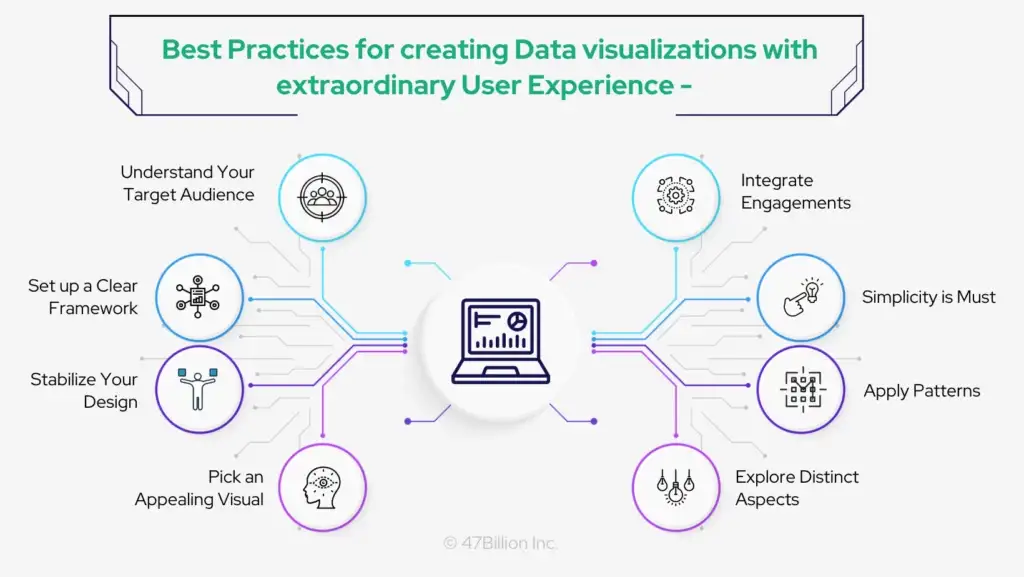
1. Understand your target audience
Before you start selling data into your Visualization, start by delivering substantial amounts of information in a way that decision-makers can quickly understand. A successful user experience depends on the designer having a clear grasp of the targeted audience and focusing on three essential elements:
- Who is the target audience, and how will they read and comprehend the content?
- How will the visitors interact with the information, and what will most benefit them?
- What is the purpose of the Visualization, and how can viewers respond to it?
2. Set up a clear framework
The UX designer must ensure that everyone who sees it understands what it depicts. To accomplish this, the designer must provide a precise framework, including the semantics and syntax used to analyze the data information. Syntax refers to communication organization, whereas semantics deals with the meaning of the words and pictures utilized.
For instance, when employing an icon, the element should resemble the thing it symbolizes, with the viewer understanding its meaning through its size, color, and placement.
Simple, schematic geometric shapes like lines and bars are essential to many visualizations because they link to represent relationships. On the other hand, bars limit and demarcate.
People frequently perceived lines as trends and bars as discrete relations when asked to interpret an unlabeled line or bar graph in experiments, even when this interpretation conflicted with the nature of the underlying data.
3. Pick an appealing visual
First and foremost, it’s critical to comprehend the amount of data at hand. Then you may decide which elements to visualize and what information to convey. After that, you can choose the most appropriate and user-friendly visual format for your intended audience.
4. Stabilize your design
Visual components like texture, color, shape, and negative spaces must be evenly dispersed across the story. You can choose from symmetrical, asymmetrical, or radial graphics and decide which balance of elements best represents your data.
5. Simplicity
Ensure that your graphics are straightforward and uncomplicated. We suggest you avoid adding unnecessary information that needs to be clarified. Remember that simplicity is the ultimate goal of data visualization. You can create more images if you want to tell a complex story.
6. Integrate engagement
You can employ interactive graphs and charts by deploying data visualization applications. However, because the main goal is to dispel doubts or questions, ensure the target audience understands this.
7. Apply patterns
With the assistance of patterns, you may collectively display similar types of information. You might build a method using comparable chart kinds, colors, or elements.
8. Explore distinct aspects
To comprehend data easily, you might present a side-by-side comparison of several elements. To precisely compare data, you can also align it horizontally or vertically, depending on your target audience.
Conclusion
Data visualization with good user experience and design enables users to take actions based on the displayed information. Since good data visualization and UX patterns are more understandable than data, the best way to drive actions is through storytelling using data.
Master the art of narrating a story using numbers!
Users are drawn to interactions rather than no interaction with the static content. For example, charts where we can, through a single tap, makes people feel powerful as they get everything at their fingertip.
Choosing the finest visual, balancing the design, concentrating on crucial regions, keeping the visuals basic, utilizing patterns, comparing parameters, and incorporating interactivity are some essential components of efficient data visualization.
Write to us at hello@jp.47billion.com!